The Science behind #TheDress
Color perception is relative, as is human perception in general and it is easy to understand this if we use price as an example. The dress in question costs 77 dollars. Is it expensive or cheap? It depends. It’s ridiculous for a Hollywood actress, but expensive for a beggar anywhere in Brazil.
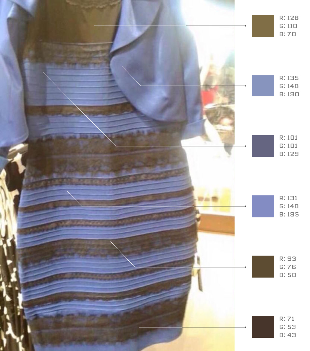
And what does price have to do with color? Just as expensive and cheap depends on one’s bank account, the color of the dress also depends on how one’s brain works. In the case of #TheDress, people fall into two categories, gold-and-white or blue-and-black. The color of the original dress is blue-and-black, but what matters is the photo thatgenerated a very dressdifferent (illustration above) and observers are divided between blue-and-black or gold-and-white. Who is right? Everyone.
Our brain is equipped with a mechanism called perceptual constancy. What is this for? To bring some stability to our already troubled lives. In the specific case of color, constancy is a mechanism that is constantly discounting changes in lighting so that the color of objects remains stable. Without color constancy we would perceive objects constantly changing color because the light emitted by them – in fact – changes according to the change in lighting, whether natural or artificial. In other words, we do not see differences where they exist and therefore “we do not see the world as it is, but rather how it can be useful to us” as Beau Lotto.
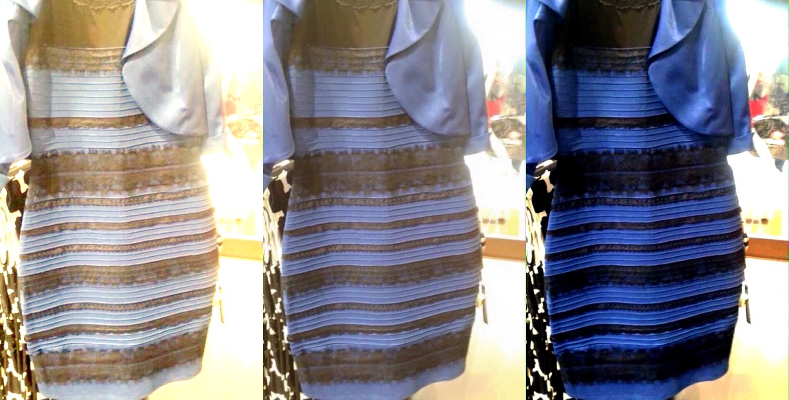
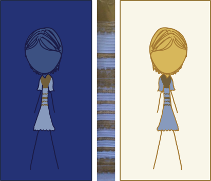
Some brains assume that the lighting is yellow and discount that lighting by noticing the blue-and-black dress, and others assume that the lighting is blue and discount that lighting by noticing the gold-and-white dress. The simulation below is the one that best illustrates the difference between the one that discounts the blue lighting (left) and the one that discounts the yellow lighting (right).
If the task was to decide between blue or green lighting, the dress had not become a success. Blue and green are not opposing colors and the differences would have gone unnoticed. Discounting blue lighting generates a perception where yellow predominates and discounting green generates a perception where red predominates. Yellow and red are two different colors but between them there is a multitude of reddish-yellows, orange-yellows, reddish-oranges, among many other similar descriptions that we are already used to and would not cause any controversy.
In the case of blue and yellow, which are opposing colors, when the brain assumes one or the other, the perceptual result is completely different. Discounting blue lighting generates a perception where yellow predominates and soon people perceive gold-and-white while discounting yellow generates a perception where blue predominates and people perceive blue-and-black. Between blue and yellow there is no intermediary because there are no blue-yellow or bluish-yellow and therefore we name it yellow or gold or any other name that does not contain blue, or we name it blue or any other name that does not contain nothing yellow and that’s where the screaming difference lies.
What makes one person see gold-and-white and another person see blue-and-black? In my research, 50% perceive gold-and-white and 50% perceive blue-and-black. If this result is confirmed, the choice between seeing gold-and-white or seeing blue-and-black may be a mere result of chance orchestrating our brains just as flipping a coin is also a work of chance. If my sample is not confirmed, the answer lives somewhere else and Drummond was right because “each one chose according to his whim, his illusion, his myopia”. In this case, further research could help us understand what differs those who see gold-and-white from those who see blue-and-black, but in one way or another, everyone is right why our minds were designed to see a little but not a lot and this varies from brain to brain.
Color is often thought of as a quality of the object or light, but this is not true. Color is a mental phenomenon determined by neuronal processes and light is just the beginning of this process that ends with the perception of one or more colors. The experience of blue-and-black or gold-and-white, like all other colors, is a mental construct.
A Long version of this article can be read at The Polemic of the Dress teaches: We see what wethink!
Claudia Feitosa-Santana is a neuroscientist and specialist in color perception, with a master’s degree in experimental psychology and a doctorate in neurosciences and behavior from the University of São Paulo, and post-doctorate in integrated neurosciences from the University of Chicago. She lives in Chicago and is currently a professor at The School of The Art Institute of Chicago and Roosevelt University.