The Polemica do Vestido teaches: We see what we think!
If you prefer a short version, read
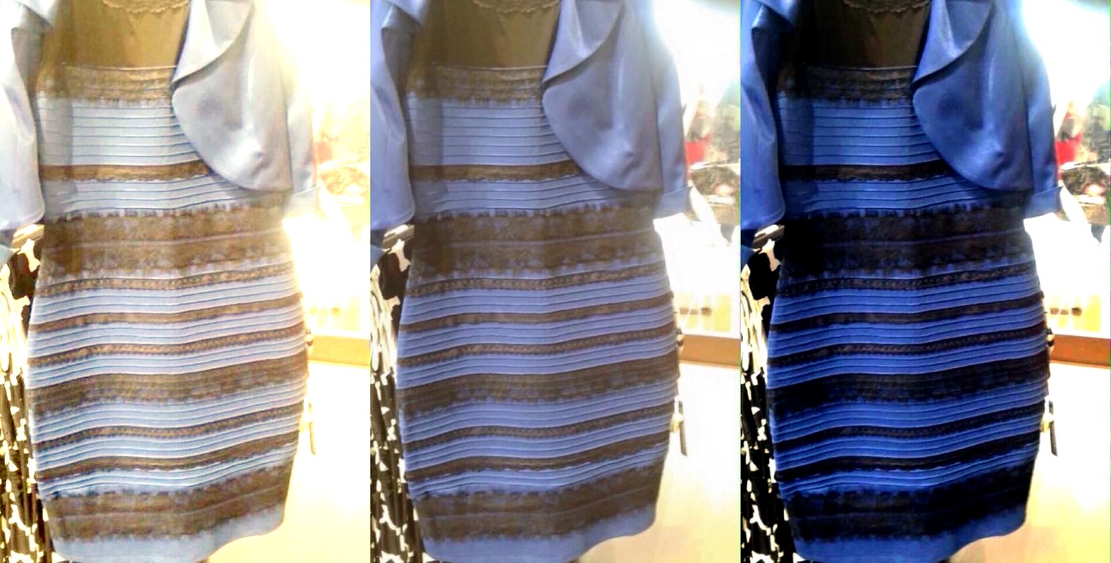
The dress color went viral. Everyone fussing over whether the dress is gold-and-white or blue-and-black. Caitlin McNeil, the owner of the dress and the photo that originated the discussion, has already revealed that the dress is blue-and-black, but the discussion doesn’t stop because now people want to understand why the world is practically divided into gold-and-white and blue-and-black. The answer is simple. We see what we think. But to understand this phrase, it is necessary to understand at least a little how the human mind works.
Color is often thought of as a quality of the object or light, but this is not true. For example, the expression “the ocean is blue” uses the perception of the color blue to describe physical light. The color itself is not in the ocean nor in the light emitted from it. Color is a mental phenomenon determined by neuronal processes and light is just the beginning of this long (but fast) process that ends with the perception of one or more colors. A wavelength close to 470 nm is usually – but not always – perceived as blue and no wavelength (light) is endowed with a color. There is no direct relationship between wavelength and color perception. The experience of blue, like all other colors, is a mental construct.
The experience of a color is like understanding a language. There is no sense in the physical sound of a Japanese sentence if the person has not learned the language just as there is no blue at wavelengths close to 470 nm. The brain needs to interpret the physical sound as well as the wavelength.
This knowledge is old but still little taught in schools in general. Isaac Newton brilliantly wrote in his book Opticks first published in 1704: “And if at some point I speak of light and rays as colored or endowed with colors, I would like to be understood as not speaking philosophically and correctly, but roughly – such conceptions would only be attributed by lay people when observing these experiments. To put it correctly, the rays are not colored. In them there is nothing but a certain power and disposition to generate the sensation of this or that color”. More than 200 years later, W. D. Wright was inspired by Newton’s words and published a book called “Spokes Are Not Colored” in 1967, stating that “color perception is within us and colors cannot exist unless there is an observer to perceive them. Color does not even exist in the chain of events between the retinal receptors and the visual cortex, but only when the information is finally interpreted in the viewer’s consciousness.”.
Human perception is relative as is color perception. But it’s easier to understand this concept of relativity if we use price as an example. The dress in question costs 77 dollars. Is it expensive or cheap? It depends. It’s derisory for any celebrity present at an Oscar ceremony, but expensive for a street woman, whether in New York or São Paulo. If we consider that the dollar now costs nearly 3 reais, this dress is more expensive for a beggar in São Paulo than for a pauper in New York.
And what does price have to do with color? Just as expensive and cheap is a judgment that depends on one’s bank account, the color of the dress also depends on how each observer’s brain works and, in the specific case of the dress, people fall into two categories, gold -and-white or blue-and-black. The dress color as we already know is blue-and-black, but the photo generated a different (see illustration above) that most observers will perceive as either blue-black or gold-and-white. Who is right? Everyone.
The way I found to explain why everyone is right is to apply the knowledge I have to understand the dress controversy.
I’m a neuroscientist and an expert in color perception, and I woke up on Friday with several emails and messages about the dress. I found it extremely curious and went to check that photo and soon concluded that they were all seeing the same photo on different screens and different screens produce the emission of different lights which, in turn, influence the observer’s perception. However, a friend did not accept my explanation and was categorical in stating that the color difference was stark and even when people watched the same screen they were split between gold-and-white and blue-and-black.

I still wasn’t convinced, but I found myself with only one option, that of testing it with my own cell phone. I took advantage of the fact that I was going to run the South Side YMCA and tried it out. photo (above) on 24 people: 12 perceived gold-and-white and 12 perceived blue-and-black. At the same time, and across town, a student tested her 29 co-workers: 11 perceived gold-and-white and 18 perceived blue-and-black. I’ll skip the statistical explanation and just say that the ratio between gold-and-white and blue-and-black can only be reliably defined after rigorous testing, but what matters is that the photo is really controversial and people are divided between gold-and-white and blue-and-black. In general, color perception differences occur frequently but they are subtle and so we don’t pay attention. In the case of the photo it is stark – as my friend emphasized, it went viral and , we only talk about it.
Our brain is equipped with a mechanism called perceptual constancy, which brings some stability to our already troubled lives. Both the constancy of color and the constancy of size or shape, among others, aim to alleviate the perceptual instability of our daily lives. In the case of size, if a person is very close to you, their image projected on your retina is different from the image projected when they are far away from you, but your brain has no problem understanding that it is the same person and with the same size, neither bigger nor smaller.
In the specific case of color, this mechanism is constantly compensating for changes in lighting so that the color appearance of objects remains stable. Without color constancy we would perceive objects constantly changing color because the light emitted by them actually changes according to the change in lighting, whether natural or artificial. In other words, we don’t see differences where they exist and therefore “we don’t see the world as it is, but rather how it can be useful to us” as Beau Lotto.
The first known account of color constancy is from 1694, by Philippe De La Hire who claimed the fact that we don’t notice that colors are different in daylight or candlelight. But it was a week before the French Revolution (1789) that Gaspard Monge made a brilliant demonstration of color constancy, calling the phenomenon to the attention of the Royal Academy of Sciences in Paris. Monge, wearing a red sweater, asked his colleagues to observe her through a red lens. Surprised, those present had the feeling that the mesh had a very whitish red, practically white.
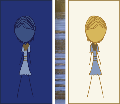
Some brains assume that the lighting is yellow and discount that lighting by noticing the blue-and-black dress, and others assume that the lighting is blue and discount that lighting by noticing the gold-and-white dress. The simulation below is the one that best illustrates the difference between the one that discounts the blue lighting (left) and the one that discounts the yellow lighting (right).
If you weren’t born into the digital age and took pictures, you’ve already had to choose between Kodak and Fuji film. Analog cameras didn’t come equipped like our brains and weren’t able to discount ambient lighting. What we call color constancy for perception, we call white-balance for photography and cinema. At that time people had two options, for photos with warmer tones Kodak film and for photos with cooler tones, Fuji film.

https://benhorne.wordpress.com/
But then, why has the world stopped to learn this mechanism just now? The constancy of color makes us not perceive differences where they exist and, in fact, the world only stopped because the difference is brutal, but to understand this difference it is necessary to understand how we build the relationships between colors (color space) within our brain.
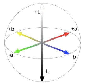
Our perception of color is based on two chromatic channels that work in opposition, blue-and-yellow and green-and-red. And what does this mean? As blue is opposite to yellow, they do not coexist and so we cannot perceive a yellowish-blue or bluish-yellow and the same goes for green and red. It is noteworthy that our vision is based on light colors and not pigment colors and you cannot understand this issue by thinking about how we make colors with ink, but that is another matter (pp. 38 of this artigo).
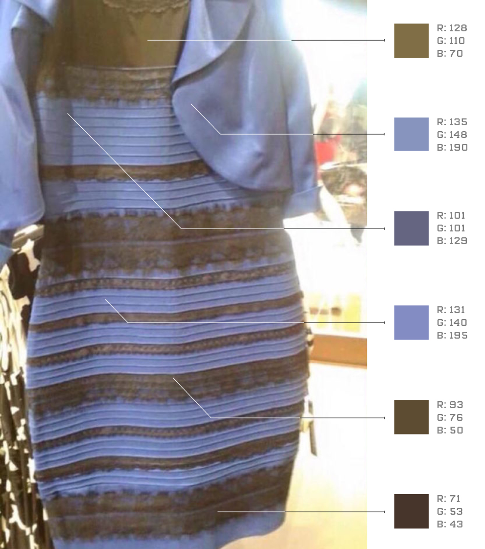
The original dress emits lights that usually make you feel the same in blue-and-black, but the dress photo came out well different. Analysis of the photo tells us that the dress should be perceived as gold-and-blue but this image is unstable and loaded with lights, imposing on the brain an arduous task of deciding in a fraction of a second which is the predominant color of lighting to discount and generate color perception and, in this photo, we have two options, discount blue lighting or discount yellow lighting.
If the task was to decide between blue or green lighting, the dress had not become a success. Blue and green are not opponents and perceptual differences would have gone unnoticed. Discounting blue lighting generates a perception where yellow predominates and discounting green generates a perception where red predominates. Yellow and red are two different colors but between them there is an infinity of reddish-yellows, orange-yellows, reddish-oranges, among many other similar descriptions that we are already used to and would not cause any controversy. In the case of blue and yellow, which are opponents, when the brain assumes one or the other, the perceptual result is completely different. Discounting blue lighting generates a perception where yellow predominates and soon people perceive gold while discounting yellow generates a perception where blue predominates. Between blue and yellow there is no chromatic intermediary, that is, we call it yellow or blue and therein lies the explanation of the glaring difference.
A little over 100 years ago, Ewald Hering proposed that the experience of color results from the analysis of colors in opposite pairs. Green opposing red. Blue opposing yellow. So, he explained why we are not able to see reddish-green or blue-yellowish and also used examples of after-images that we can see after staring for approximately 30 seconds on the same image, see the rainbow below. Later, it added the white-black channel to the green-red and blue-yellow channels.

AIn addition to the chromatic channels, we have a third channel, black and white, but unlike the color channels, between white and black there are many shades of gray. Just as looking at the red mesh with a red filter makes us see it as practically white, discounting the blue lighting makes us perceive the blue in the photo as white, while discounting the yellow lighting makes us perceive the gold in the photo as black.
What makes one person see gold-and-white and another person see blue-and-black? If my small sample that 50% perceives gold-and-white and 50% perceives blue-and-black is confirmed, we have to consider the possibility that the choice is a mere result of chance orchestrating our brains, just as flipping a coin is also a work of chance. If my sample is not confirmed, the answer lives elsewhere. In this case, further research could help us understand what differs those who see gold-and-white from those who see blue-and-black, but in one way or another, everyone is right why our minds were designed to see a little but not much and this varies from brain to brain and Drummond was right because “each one chose according to his whim, his illusion, his myopia”.
Abridged version of this article at The Science behind #TheDress
Claudia Feitosa-Santana is a neuroscientist and specialist in color perception, with a master’s degree in experimental psychology and a doctorate in neuroscience and behavior from the University of São Paulo, and post-doctorate in integrated neuroscience from the University of Chicago. She lives in Chicago and is currently a professor at The School of The Art Institute of Chicago and Roosevelt University.